Pi Studio

Dart Caffeine

project

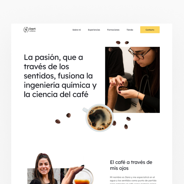
The Dart Caffeine project focused on reorganizing and optimizing the online presence of this personal brand, with a clear focus on improving visibility and accessibility for both the brand and its users. The main task was to create a user experience that would allow visitors to easily obtain information and contact information and raise awareness of the various services and activities offered.

typography

Lexend

colors

#1D1F26

#F6A094

#FBD45C

#57C4DD

target

  • Reorganize and simplify the existing information on the web.
  • Make the brand and its representative more accessible and easier to find.
  • Destacar todos los servicios, talleres, cursos y viajes disponibles.
  • To highlight all the services, workshops, courses and trips available.

implementation

To achieve these objectives, the website was thoroughly restructured. Navigation menus were simplified and a clear and clean design was created that prominently presented the services and activities available. In addition, existing content was optimized to improve search engine visibility and fresh and engaging content was added for workshops, courses and trips. A clear and user-friendly contact section was also implemented to make connecting easy for visitors.
results

The result of this project was a website that effectively reflects the Dart Caffeine brand. Visitors can now easily find information about the services, courses and activities offered. The brand and its representative are more accessible than ever, which has led to an increase in user interaction and inquiries. The new website is a valuable resource for those seeking the services and expertise that Dart Caffeine offers.

other projects